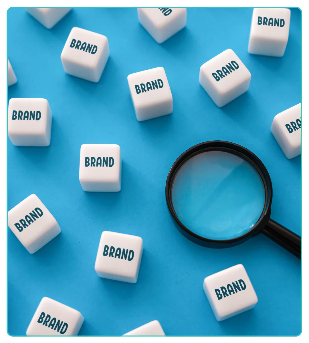

How to Make Brand Identity for Startups : A Detailed Guide
Why brand identity matters (short answer)
Start with strategy: your one-page brand brief
Research and inspiration: build a tight moodboard
Naming, tagline and core messaging (short but vital)
Design the visual system: logo, color and typography
Voice and messaging: how your brand speaks
Build mini brand guidelines (one to two pages)
Apply, test and iterate the 90-day loop
Examples and short case lessons
Common mistakes and how to avoid them
How to measure brand identity success
Budget and timeline (practical options)
Creating a meaningful brand identity is one of the best investments a startup can make for startup branding. Brand identity is how your company looks, sounds and behaves the logo, colors, typography, imagery, tone of voice and rules that together shape the first impression people get of your business. For founders asking how to make brand identity for startups, the right approach is strategic, iterative and cost-effective: define the core first, then build visuals and rules that scale as you grow.
This guide explains step-by-step how to make brand identity for startups (including online and free options), gives real examples, warns about common mistakes, and offers a practical checklist and budget guidance so you can launch a solid identity without wasting time or money.
Why brand identity matters (short answer)
Brand identity matters because people form judgments in seconds. When a visitor lands on your homepage, sees your app icon, or opens an email, visual and verbal cues decide whether they trust you enough to click, sign up, or buy. For startups, strong identity also helps marketing perform better, shortens sales cycles, improves hiring, and makes investor conversations feel cleaner and more professional. A well-designed identity is not decoration it’s a tool that reduces friction and raises perceived value.
Start with strategy: your one-page brand brief
Before colors and logos, you must be clear about why you exist and who you serve. The single best habit is to write a one-page brand brief. Keep it short one page only but make it decisive. That one page becomes the north star for all design and communications.
Include these elements in the brief (use bullets for clarity when you share it with the team):
Mission: one sentence that explains why your startup exists.
Target audience: 1–2 buyer personas (age, job, problem).
Core value proposition: what problem you solve and how you are different.
Three brand personality words: e.g., “practical, human, modern.”
Primary touchpoints: website, mobile app, pitch deck, email.
Writing this brief forces clarity. When designers or copywriters ask “should it be playful or formal?”, your brief gives an answer. It also prevents endless design debates and keeps early work focused and fast.
Research and inspiration: build a tight moodboard
Once your brief is done, do visual research. The goal is not to copy but to collect signals: moods, color directions, photography styles, icon sets and layouts that feel right for your audience. A moodboard organizes inspiration so you don’t mix unrelated styles.
Practical steps (bulleted so you can follow them quickly):
Capture 8–12 examples: competitor sites, apps, ads, and packaging you admire.
Note why each item fits your brief (tone, color, emotion).
Use tools: Pinterest or a simple Figma/Canva board works perfectly.
Identify 2–3 recurring visual patterns you like (e.g., bold typography + minimal photography, or hand-drawn icons + warm colors).
A well-curated moodboard clarifies the aesthetic direction and speeds the design process. It’s also a simple deliverable you can share with freelancers to get aligned work quickly.
Brand Essentials: Naming, tagline and core messaging (short but vital)
If your startup still needs a name or a tagline, handle this before heavy design work. Names and taglines anchor identity the visual system will grow around them. When evaluating name options, prioritize pronounceability, memorability and domain/handle availability. Test names with a few people from your target audience; strangers give better feedback than friends.
Key checklist when choosing a name:
Is it easy to pronounce in the markets you’ll serve?
Is the .com (or relevant TLD) or a consistent social handle available?
Does the name avoid bad or awkward meanings in other languages?
Can it scale if you expand product lines or geographies?
A short, clear tagline (5–8 words) that explains your main benefit helps landing pages and investor slides be immediately understood. Combine a name and tagline with the one-page brief so all creative work flows from the same promise.
Design the visual system: logo, color and typography
Design is the most visible part of brand identity, but it should be practical and tested. Your visual system needs three basic components: a logo system, a color system, and typography choices. Keep each one constrained and purposeful.
Practical recommendations (bulleted for quick copy-paste to a brief):
Logo system: create a primary logo, a stacked version, and a compact icon for favicons and app icons. Export as SVG + PNG.
Colors: pick 2 primary colors, 1–2 accents, and neutral palette (background, text, border). Record HEX/RGB values.
Typography: choose one display font and one body font; use web-safe or Google Fonts for easy licensing.
Imagery rules: define photo style (high contrast, candid people, product close-ups) or illustration style (flat, line art).
Accessibility: test color contrast for legibility; ensure font sizes are legible on mobile.
Test your logo and palette in small sizes and in multiple contexts the icon should still be recognizable as a 32×32 favicon. Simplicity wins: avoid overcomplicated marks that break in small applications.
Voice and messaging: how your brand speaks
Your brand voice is the personality in text. It appears in headlines, emails and support replies. Decide whether your voice is casual, authoritative, playful, technical, or empathetic and make small, actionable rules.
Simple voice guide to create (bulleted format for use):
Tone anchors: 3 adjectives (e.g., “clear, friendly, helpful”).
Sample headline: one line you’d use on home page.
Sample email subject: a short support or marketing example.
Dos and don’ts: 3 short rules (e.g., DO use short sentences; DON’T use industry jargon).
Keep voice consistent across product copy, marketing and support. Consistency builds trust and makes your brand feel coordinated even when different people write.
Build mini brand guidelines (one to two pages)
You don’t need a 80-page brand book at the start. What the team and contractors need is a mini guideline containing “must-follow” rules: logo usage, colors, fonts, voice rules and layout examples.
Include these items (bulleted list for your reference):
Logo clearspace and minimum sizes.
Color palette with HEX codes and roles (CTA, background).
Typography scale: H1, H2, body sizes.
Iconography and image style examples.
Voice dos and don’ts with 2–3 examples.
A compact PDF or single Google Slide is perfect. It’s light, shareable, and enforces consistency without slowing you down.
Apply, test and iterate the 90-day loop
Brand identity is not “done” at launch. Treat the first three months as a learning period.
A practical 90-day plan (bulleted so it’s easy to follow):
Week 0–2: Apply identity to homepage, app header, and one landing page.
Week 3–6: Publish 3 brand-led social posts and a branded email campaign.
Week 7–12: Collect feedback user interviews, quick surveys, social comments.
End of 90 days: Review KPIs and decide what to tweak (colors, tagline angle, or imagery).
Measure simple indicators: landing page conversion rate, click-through on branded ads, social engagement, and qualitative user impressions. Small data sets are fine the goal is to learn quickly and iterate.
Helpful online and free tools
You can build most of a startup brand identity without expensive tools. These platforms are practical and widely used:
Figma (free): collaborative design and system building.
Canva (free): fast templates and non-designer friendly assets.
Google Fonts: free web fonts for consistent typography.
Unsplash / Pexels: royalty-free photography.
Coolors / Color Hunt: quick palette generators.
Google Docs / Slides: build and share your brand brief & mini guidelines.
Using these tools you can run a week-long sprint to produce a usable identity: brief, moodboard, 2 logo options, palette and a 1-page guide.
Examples and short case lessons
Real startup examples help crystallize the point:
Airbnb started descriptive and evolved into a symbolic, flexible mark. Lesson: a name + symbol that can grow beats descriptive overload.
Slack used a short, memorable name and a friendly voice that matched its product: workplace communication. Lesson: match voice to audience.
Notion relies on minimal typography and modular UI; the visual system foregrounds content and adaptability. Lesson: design for flexibility.
You don’t need to mirror these companies; study why they work and adapt the principles (simplicity, consistency, adaptability) to your context.
SEE OUT PAST BRANDING CASE STUDIES OF SUCCESSFULLY LAUNCHED STARTUPS HERE

Common mistakes and how to avoid them
Founders often make the same avoidable errors. Here are the big ones and how to prevent them:
Designing before strategy — always start with a one-page brief.
Too many logo variants — limit to primary, stacked, and icon.
Ignoring legibility — test on phones and in small sizes.
Choosing hard-to-spell names — prioritize pronounceability for referrals and voice search.
No guideline enforcement — have a simple PDF and require its use for all public assets.
Prevent these problems by making quick, documented decisions and enforcing the mini guidelines.
How to measure brand identity success
Branding mixes qualitative and quantitative signals. Track a few simple metrics to know whether identity changes work:
Landing page conversion before and after identity updates.
Branded search volume (do more people search your name?).
Social engagement on brand-led posts vs. performance posts.
User feedback: ask a short question in a signup flow or NPS follow-up about brand clarity.
Pick one or two KPIs for the first 90 days too many metrics dilute focus.
Budget and timeline (practical options)
You can build a usable identity on different budgets. Typical ranges:
DIY / low budget: $0–$1,500 use free tools + a freelancer for polish. Timeline: 1–4 weeks.
Freelancer / small studio: $2,000–$8,000 includes strategy, logo, palette, guide and a basic landing page. Timeline: 4–8 weeks.
Agency / full package: $10,000+ deep research, full identity, web design and rollout. Timeline: 8–12+ weeks.
Start small with core assets and only escalate spend once you’ve validated product-market fit and the brand’s direction.
Quick checklist: 70/30 actionable mix
Below is a compact checklist (bulleted) to help you run the project fast:
One-page brand brief completed.
Moodboard with 8–12 visual references.
2–3 name/tagline options tested with users.
Logo system (primary, stacked, icon) exported as SVG and PNG.
Color palette + HEX codes documented.
Typography selected (headline + body).
1-2 page brand guide created and shared.
Homepage/landing page updated with new identity.
3 branded social posts created and scheduled.
90-day review scheduled with KPIs.
Use this list as a sprint plan: finish the brief and moodboard first, then run two design sprints to get assets and guidelines ready.
Conclusion
When founders ask how to make brand identity for startups, the best answer is this: start with clarity, design with constraints, and iterate with users. Brand identity is a system a set of rules that makes your company recognisable and trustworthy. You don’t need perfection at day one; you need a clear brief, a usable visual system, consistent voice and the discipline to apply those assets across customer touchpoints. Build fast, test what matters, and refine based on real user signals. That approach will give you a strong, practical identity that grows with your startup.