Best Colors for Food Business Branding
Why Color Matters in Food Branding
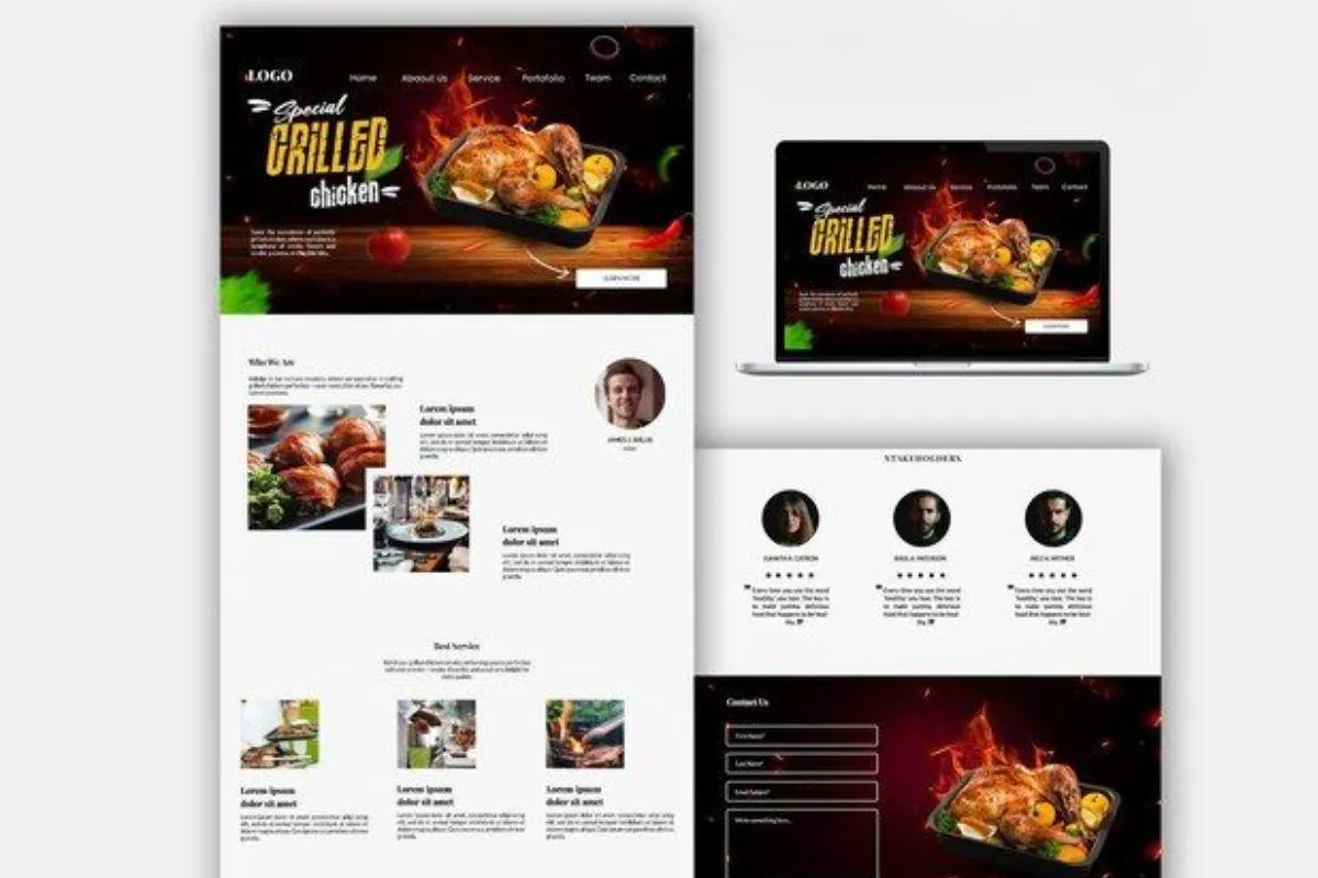
1. Red – Appetite, Passion, Energy
2. Yellow – Optimism, Youth, Attention-Grabbing
3. Orange – Playfulness, Value, Warmth
4. Green – Health, Freshness, Eco-Friendly
5. Blue – Trust, Cleanliness, Reliability
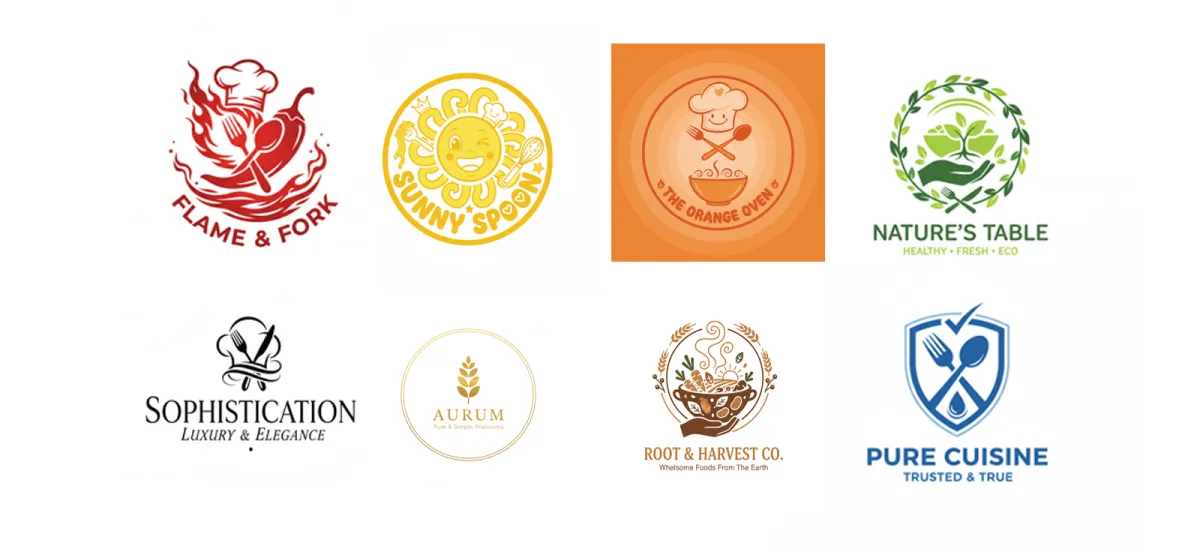
6. Black – Sophistication, Luxury, Elegance
7. White – Purity, Simplicity, Clean
8. Brown – Warmth, Earthiness, Wholesomeness
How to Choose the Right Color Palette for Your Food Brand
Popular Color Combinations in Food Branding
Examples of Food Brands and Their Color Strategy
Colors have a powerful impact on how people perceive your food business. Whether you're running a restaurant, a food truck, a catering service, or launching a packaged food brand, the color palette you choose can shape your brand identity, influence customer behavior, and even drive more sales.
Color isn’t just decoration - it’s a strategic branding tool that connects emotionally with your customers.
In this blog, we’ll dive into the best colors for food business branding, the psychology behind each shade, and how to choose a color palette that reflects your brand personality and builds customer trust.
Why Color Matters in Food Branding
Colors trigger emotions and associations. In the food industry, color can make or break your first impression. A warm red may spark hunger, while green suggests freshness and health. Strategic use of color:
- Enhances brand recall
- Builds emotional connections
- Influences purchase decisions
- Communicates brand values
When choosing a brand color, think about your audience, your cuisine, and the experience you want to offer. Let's explore the top colors that dominate successful food branding.
8 Best color themes for food business startups
- White & Gold – Purity, Simplicity, Clean
White conveys cleanliness and minimalism. It’s often used in combination with other colors to balance out brightness or intensity. It’s also a popular base for packaging and websites.
Best for: Clean eating brands, bakery, frozen foods

- Brown – Warmth, Earthiness, Wholesomeness
Brown communicates authenticity and natural quality. It’s often used for baked goods, chocolate, or brands that focus on tradition and comfort.
Best for: Bakeries, organic snacks, chocolate brands

"A great real-world example of brown done right is Cookies by Freddie, a Baton Rouge cookie brand we rebranded from scratch. We built their entire identity around a brown and gold palette — brown for the warmth and authenticity of homemade baking, gold to signal that this was a premium product for weddings and events. The combination helped transform a home baker into a brand that now operates Baton Rouge's first cookie truck"


- Red – Appetite, Passion, Energy
Red is one of the most common colors in food branding. Why? Because it’s known to stimulate appetite. Think McDonald’s, KFC, or Pizza Hut. Red creates a sense of urgency and encourages people to eat and act quickly—perfect for fast food and delivery services.
Best for: Fast food, spicy cuisine, food delivery apps

- Yellow – Optimism, Youth, Attention-Grabbing
Yellow is another color that boosts appetite and energy. It’s bright, cheerful, and grabs attention. It also pairs perfectly with red, making the combo a staple in many food brand logos.
Best for: Family-friendly food brands, snacks, food trucks

Orange – Playfulness, Value, Warmth
Orange blends the energy of red and the friendliness of yellow. It suggests affordability and fun. Brands like Fanta and Cheetos use orange to signal their playful, youthful vibe.
Best for: Snacks, beverages, casual food businesses

Green – Health, Freshness, Eco-Friendly
Green is the go-to color for health-focused food businesses. It suggests nature, organic ingredients, and eco-conscious values. Think of brands like Whole Foods or Sweetgreen.
Best for: Organic food, vegan restaurants, eco-brands

Blue – Trust, Cleanliness, Reliability
Blue is a color of trust and professionalism. While it’s not commonly used to stimulate appetite, it works well for water brands, seafood companies, or tech-forward food platforms like delivery apps.
Best for: Seafood, food delivery platforms, bottled water

Black – Sophistication, Luxury, Elegance
Black gives a premium feel. It's bold and timeless, great for high-end food brands or those targeting a more refined clientele. It works best when paired with metallics like gold or silver.
Best for: Luxury restaurants, gourmet brands, premium packaging

How to Choose the Right Color Palette for Your Food Brand
Choosing your color palette isn’t just about preference—it’s about strategy. Here’s a checklist to help guide your decision:
Popular Color Combinations in Food Branding
Examples of Food Brands and Their Color Strategy
- McDonald's logo brand tone:
Red and yellow for speed, hunger, and friendliness
- Subway logo color strategy:
Green and yellow to emphasize health and freshness
- Coca-Cola logo stands for:
Red for passion and energy
- Cookies by Freddie
Brown + Gold to communicate warmth and luxury for a wedding-focused cookie brand. [See how we built it →]
- Chobani brand stone & theme:
Soft green and cream for organic, natural appeal
- Whole Foods:
Deep green to communicate eco-friendly values
Final Tips for Using Color in Your Food Branding
Test color palettes on different backgrounds and packaging.
Keep accessibility in mind—make sure your text contrasts well.
Use color psychology in combination with typography and imagery.
Be consistent across platforms—from logo to website to social media.
Conclusion
Color isn’t just decoration—it’s communication. In the food business, where emotion and experience drive decisions, the right color palette can elevate your brand, connect with your audience, and increase sales. Whether you’re going bold with red, clean with white, or eco-friendly with green, be intentional with your choices and always design with purpose.